To generate oracle workload metrics report, use the following query to generate date
sqlplus>
col metric_name format a39
select metric_name,substr(to_char(begin_interval_time,'hh24:mi'),1,4)||'0' snapshot,
sum(case to_char(begin_interval_time,'yyyymmdd') when '20120208' then round(average) end) as date20120208,
sum(case to_char(begin_interval_time,'yyyymmdd') when '20120209' then round(average) end) as date20120209,
sum(case to_char(begin_interval_time,'yyyymmdd') when '20120210' then round(average) end) as date20120210
from DBA_HIST_SYSMETRIC_SUMMARY,dba_hist_snapshot
where dba_hist_snapshot.snap_id=DBA_HIST_SYSMETRIC_SUMMARY.snap_id
and metric_name in ('Physical Reads Per Sec','Physical Writes Per Sec','Redo Generated Per Sec','Logical Reads Per Sec','Host CPU Utilization (%)','Current Logons Count','Executions Per Sec')
and to_char(begin_interval_time,'yyyymmdd') in ('20120208','20120209', '20120210')
and to_char(begin_interval_time,'hh24') in (09,10,11,12,13,14,15,16,17)
group by metric_name ,substr(to_char(begin_interval_time,'hh24:mi'),1,4)||'0'
order by 1,2
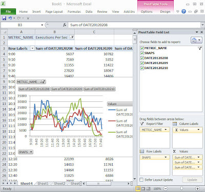
copy the output to excel and draw a pivotal chart in excel.
1. when copy the data in excel, it may all fit in one column, you can use data->text to column -> fixed_width to split the data into multiple columns.
2. in excel, click on menu insert->pivotal chart, then tick all the fields to add to report, drag metrc_name into report filter.
3. right click on the pivotal chart, and change chart type to line.
then you will get a chart like the screen showned in this blog.
if you want to choose 'Logical Reads Per Sec', simply click on the metric_name filter and choose it.
Comments
Post a Comment